Friday, March 27, 2015

Principles of Design- Rythm


Edits:
Temperature: +9
Tint: -5
Exposure: +.85
Contrast: -19
Highlights: -48
Shadows: +48
Whites: +8
Blacks: +1

Rhythm was defined by using several different principles of design to create organized movement. This photo is a little darker in the bottom left, but as you follow it up to the upper right the photo becomes lighter. There is repetition within the railings, with the poles that keep them standing. There is also balance, the structure on the left takes up part of the frame, but is balanced by the lack of structure on the right. Each rectangle in the cement creates a path going up the ramp, and you can image following it, jumping from one to the next, like their is a rhythm to it. 

Principles of Design- Proportion


Edits:
Tint: -25
Exposure: +1.3
Contrast: -25
Whites: +41
Clarity: +45
Saturation: +21

In this photo I was trying to be creative in showing proportion using small things. The water nozzle thing is small, and so is the whip cream cap, but I got close and made them fill part of the frame. The cap was the perfect size to make a little hat for the nozzle 

Lens Photo - Variety

Our group chose photo number 5 to show variety

It shows variety through multiple uses of principles of design. The people in the background create balance with those in the foreground. Your eye is immediately drawn to the girls flute or the can on the left because they are the only things in that third of the picture, thus showing emphasis. Once the eye is drawn the to the flute it follows the straight line it creates to the right, then it may see the drummers sticks and follow those, or got along to the upper right and look at the peoples faces one by one. It also shows good rhythm. You can see the different levels of dancing that people are at, and the flutist leaning back to her music and the drummers concentration give the feel as if the music is coming through the photo.

Monday, March 23, 2015

Movie Monday Half Past Autumn Part 3 and 4

1) Success to me is accomplishing what you want and having the outcome you want. You could be successful by making a lot of money if that's what you want, or you could be successful by managing your office well. For me, I would like to be successful in the fact that I make a decent amount of money, probably by running an important part of a corporation.

2) To be successful in school I had to give up some success in cross country. I didn't have the time and energy to do both as best I could, so I had to choose which one I would devote my energy to, and I chose school. (I still did cross country but I didn't improve any from last year)

3) Gordon gave up his family life and a lot of money at times to be successful.

4)Her step-father was one of the founding father of the UN, Ambassador V.K. Wellington Koo

5) At first 5,000 but then it was changed a few times and ended at 10,000 dollars

6) A half million dollars

7) He refused the money because he believed Muhammad would influence what he created. He refused based on his principles.

8) The learning tree was the first major Hollywood film written and directed by a black person.

9) Shaft was the first black super hero. He gave young black kids a role model to look up to that they didn't have before.

10) Gordon's choice of weapons were film, photography, writing, and music.

11) She said it was to much to manage the turmoil in Gordon's life, and that they hardly saw each other and both were occupied with their carriers.

12) the movie 12 years a slave.

13) Gordon Parks Jr. was Gordon's oldest son. Like his father he was a successful film director. He died in a tragic plane crash on his was to film a new movie.

14) My favorite photo is called "Grease Plant Worker" under Gordon's Standard Oil archive.

15) I will remember Gordon for his ideals. I'll remember how he doesn't do what he disagrees with. He turns down large sums of money because he doesn't agree with the message he is suppose to convey. I will also remember how he worked because that's what he loved to do, he was to busy to worry about racial boundaries, he just acted a person.

Thursday, March 19, 2015

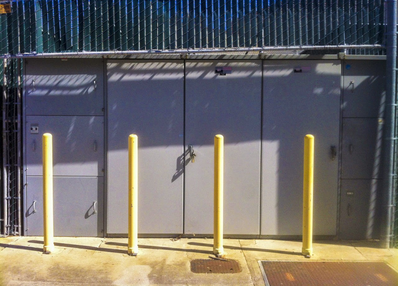
Principles of Design- Repetition


Their is repetition in the 4 yellow pole things, they separate the photo into sections. There is also repetition in the slats of the green planks on the top of the photo, and also repetition with the three doors behind the yellow poles. 

Edits:
Cropped
Contrast: +36
Highlights: +65
Shadows: -20
Whites: -25
Blacks: -27
Clarity: +33
Vibrance: +56
Saturation: +6

Principles of Design- Pattern


The pattern can be seen in the bricks, how each brick is off set with the row below it, but then in line with the next. There is also some pattern in the fact that the bricks make steps on the right side.

Edits:
cropped
Exposure: +.30
Contrast: +66
Highlights: +3
Whites: +23
Blacks: -23
Vibrance: +37

Thursday, March 12, 2015

Principles of Design- Movement


I tried to show movement by using the lines that the fence created. You start looking at the close part of the fence, but as you move down you notice lines, so you follow those. The lines fade but then the street picks up the lines at a new angle and you follow that. on the far right the sky is brighter than the rest of the picture so you look their and then continue looking through the trees along the top. Or you may have gotten to the right side and moved down towards the shadow and followed the rough line the yellow leaves made. 

Edits:
Cropped
Contrast: +12
Highlights: -28
Shadows: +48
Whites: +39
Vibrance: +34
Saturation: +13