Wednesday, June 10, 2015

Final Exam

4) The Photo that changed the was I view photography is this one

It changed the way I view photography because it taught be to look everywhere and at anything. I learned that even seemingly boring things like a crack in the ground can be a really cool picture if you just use a little imagination. I also prefer taking pictures of objects more than of people, so this photo kind of proved to me that I can take really cool pictures and that I don't need to have a person in the picture.

5) Shape is different than form because it is only 2 dimensional. It can have length and width, but it has no depth to is. Form on the other hand is 3 dimensional. It has length, width, and depth to it.  


6) Pattern is the simple repeating of an object throughout the picture. it could be multiple trianlges in a picture all just sitting there. Repetition may also have multiple similar objects, but they work together to make the photo look active. Repetition helps to create unity in a picture. 

Pattern link: http://missionphotoclass.blogspot.com/2015/03/principles-of-design-pattern.html

Repetition link: http://missionphotoclass.blogspot.com/2015/03/principles-of-design-pattern.html

7) Link to my Weebly about page: http://missionphotoclass.weebly.com/about.html
Link to another photographer's about page who inspired me: http://blog.freddieardley.com/About

8) links for the projects:

Most recent: http://missionphotoclass.blogspot.com/2015/06/final-project-relaxing-away-from-finals.html
second most recent: http://missionphotoclass.blogspot.com/2015/05/presentation-project-photos.html
third most recent: http://missionphotoclass.blogspot.com/2015/05/commercial-photo-shoot-one-fish-two.html

I think the second most recent project was my best, it's the one with all the sideways/inverted pictures. This is my best work because all the pictures in the project are unique, with a unifying element, and all skillfully incorporate the elements of art and principles of design. Doing this project really made me think differently than I had for any other project. Usually I could just look around for something that looks cool and take a picture of it, but for this project I really had to think an plan a lot before I could start shooting. I learned that what you envision may not always be possible, and that you will have to change your plans to accommodate that. Like I said above, I had to plan, and that includes where and how to shoot the pictures. I had to completely invert the my mind and look at a place upside down or sideways to see if it looks like a good place. Now that it is over I will always be looking for places that would work well for inverted photos.


Monday, June 1, 2015

Final Project Photo Shoot Idea List

Similar photos to this one. I'm thinking of going to cool places and have chairs and maybe tables set up like someone would be sitting there, but they're not.

http://anthologymag.com/blog3/wp-content/uploads/2011/04/dedon_4.jpg

List
1) Located at the creek by mission high school. On the side closer to Palm were there is actually water. Taken after school and using one of those portable camping chairs.

2) Located in my backyard. Two fancy metal chairs and a metal table will be set up near the rose bushes. I have one of those film nior style street lights there so it will shine down. Maybe have a candle on the table. It will be taken at nighttime using a tripod.

3) Located on this path in my neighborhood that goes by some redwood trees. Might use camping chair or the metal one, not sure yet. Taken after school.

4) Located at Lake Elizabeth, taken after school or closer to sunset, depending on the lighting. This one will be right on the water. There are benches lining the lake so I might use on of those, or I will bring a chair. I'll probably set it up by a tree cause trees are cool and look good.

5) Located at Old Mission Park taken after school. There is a high part at the park with really tall reed things and it over looks part of a valley and part of the town. I'll place the chair in the middle of the big stalk things and show how it has an awesome view.

6) If 5 doesn't work out for whatever reason I have two other locations in mind. On the corner of Pine and Sabercat, or at the top of Ohlone College.

Friday, May 29, 2015

Student Website Reviews

From 1st period:

I looked at Irene Wu's Weebly. The link on her Weebly to take you to her pictures goes to her blogger, so that's why the hyperlink takes you there.

I think her best photo is the 4th photo in the series. It is the clearest of the photos and implements various elements of art. She has line, shape and form, along with a good depth of field. It is clever how the rose is behind the leaves but still the center of the picture. I especially think the inclusion of the thorns makes the picture great. Most people usually forget that roses have thorns, but she showed they are beautiful and dangerous.

From 2nd Period:

I looked at Vedant Mehta's Weebly.

I think his best picture is the 4th one in the series. It is by far the most unique of his. I light at then end of the tunnel makes a good silhouette, and because the person was moving is made an awesome blurry effect that looks amazing. The water on the bottom of the tunnel leads your eye to the end of the tunnel where the color from the graffiti makes the photo really pop.

From 4th Period:

I looked at Tulika Mohanti's Weebly.

Her best photo is the 2nd in the series, the one with a girl holding a leaf in front of her eye. The color of the leaf matches the models hair very well, and she seems very natural and like she isn't trying to hard to pose. The leaf in front of her face is very clever, and they did a good job making sure that it didn't cover to much of her face. The leaf and trees in the back give a feel like it was taken in the forest, and the denim jacket also fits in with that.

Friday, May 15, 2015

Presentation Project

My Five
1) Picture of track people racing on a wall- Natural lighting in the afternoon, taken at Tak stadium with my track team mates as models.
2) Hanging from a pole- natural lighting, somewhere where there is a pole, models are Katherine and Catherine
3) Sitting on steps- Natural lighting, at the steps leading down to the girls locker room, Katherine in the model.
4) Water pouring backwards from glass one- Natural lighting or small portable light, taken outside near the ground and a blank wall, Water and a bottle will be the models.
5) Watching from above (like from the lens gallery)- natural lighting in the morning, at mission san jose, taken next to a wallball wall, Katherine is the model.

Katherine's Five
1) Rock climbing on the ground- Natural lighting in the morning, Mission valley on the ground with bumpy or cracked ground. I'll be the model.
2) Sitting on curb- Natural lighting in the morning, a curb on the street (where it's not busy) I will be the model.
3) Bicycle pick- Natural lighting in the morning, grass at a park or at mission, I'll be the model and supply the bike
4) Chair against the wall- Natural lighting, during 3rd. by one of the murals on school, would need a few chairs,  Andrew or I will me the model.
5) Relaxing at an angle- Natural light in the morning, At mission valley by the earthquake support beams. I'll be the model.


This person has a few of the photos we are doing:

https://www.flickr.com/photos/sgoralnick/4482928432/
https://www.flickr.com/photos/sgoralnick/4463692552/in/photostream/
https://www.flickr.com/photos/sgoralnick/4484690260


Some inspirational photos:

http://www.hongkiat.com/blog/force-perspective-photos/
http://www.instantshift.com/2010/08/24/88-brilliant-examples-of-forced-perspective-photography/
http://lens.blogs.nytimes.com/2015/05/04/andr-kertsz-watching-from-above/

Wednesday, April 29, 2015

Pictures with Black Background

Original

after Camera Raw

Unfortunately my camera is not very good so cropping it so much made the picture really grainy.

I used a picture taken by the Hubble Space Telescope as the background. According to the news all photos taken by the Hubble are free to the public.


Tuesday, April 21, 2015

Photo Story MCW - Teacher Participation

AP Psychology teacher Karl Hui working at his desk.
He decorates his walls with representations of his culture. 

Hui waiting his turn to warm up. He claims to be camera shy.

Hui in the middle of his performance during the assembly. 

The end of Hui's performance. He bows to the audience in respect.

After his performance Hui can finally relax and let out his nerves.
He is ready to go back to his task of teaching. 


Thursday, April 16, 2015

Story with a Photo- Work Hard and Prosper


Edits:
Exposure: +.5
Highlights: -33
Whites: +9
Clarity: +16
Vibrance: +8
Saturation: +13

One of the many booths being set up for Multicultural Week. Each booth has dedicated areas in which they are allowed to set up. This booth is area number 46. During Multicultural Week many different kinds of food are sold. This one sold drinks, specifically Mexican coca-cola and Ramune (a Japanese drink). These student miss most if not all of 4th period to set up and prepare. 

Wednesday, April 15, 2015

MSJMCW Story

Culture in all Shapes and Forms:

Once a year, for an entire week, Mission San Jose High School partakes in a unique celebration. This celebration is known as Multicultural Week. Throughout the entire week the student sell diverse food for lunch and preform various acts from their culture. These performances have included hip-hop dancing, cello playing, martial arts routines, and drum routines. However, these performances aren't limited to the students. Every year world history and AP psychology teacher Karl Hui preforms an exciting martial arts routine using various weapons, such as spears and swords. This Friday will mark his 10th performance. Hui has been practicing for some time for his performance. He runs laps around the track in the mornings to stay in shape and practices his moves when he has available space. He says he is a little nervous and that he is not as prepared as he has been, but he is still excited and looking forward to showing the students part of his culture. 

Multicultural is a favorite of many students at MSJ and seeing their friends preform is fun, but seeing their teacher is an eye opening experience. It gives the students more depth and helps them realize there is more to their teachers than what they see in the classroom.  

Thursday, April 2, 2015

Shutter Speed and Everything After

I am Lucas Williams and my partner is Kevan Mathis

The photo is here

1) The shutter speed is fast. The two trucks on the right are on a highway, so they are moving fast, but they are still very clear, so it is a fast shutter speed.

2) This photo shows leading lines. There are many lines on the road and from the guard railings that all go to the back of the picture.

3) This photo has the element of art color. The blue from the left truck matches the blue side of the truck on the right. And the red and the green add vibrance to the picture.

4) this photo shows the principle of design balance. The photo is divided in half by the guard rail. On the left there is only the over turned truck, and on the right are two trucks. The two trucks have a gap in the middle where the truck on the left can fit in, so they balance the left half .


Tuesday with Farley's Kids
Shutter speed 1/500
No edits in Camera Raw

Friday, March 27, 2015

Principles of Design- Unity


Edits:
Contrast: -17
Highlights: -34
Blacks: +25
Clarity: +73
Vibrance: +43
Saturation: +17

At first this photo looks like it should be variety, but I believe on closure inspection it works well for unity. Firstly, the mural its self was designed to be abstract but coherent and work well together, so even though it is all different the colors and pictures flow into each other and mix well. Beyond the mural it's more or less symmetrical. The shadow of the speaker is centered, the two longer shadows on the sides are at the same point, and the bricks are even. This photo also uses good rule of thirds. The sky is the top third, the bricks the middle, and the grass the bottom. Then the first wall is the left side, mural is the middle, and the right bricks are the right side. There is also a ramp on the left side, making it unbalanced but the blue paper on the wall offsets it, restoring the balance and making unity. 


Principles of Design- Variety


Edits:
Temperature: +2
Tint: -14
Contrast: +18
Highlights: -8
Shadows: -11
Whites: +14
Blacks: -10
Clarity: +27
Vibrance: +12
Saturation: +30

This photo simultaneously has no symmetry and has it. The line that the top of the car creates is straights, but the line the back fence part makes is a little angled. On the left side of the photo, behind the truck is a traffic cone pole, on the right side is a statue, different but complementary. The latter on the truck in the middle of the frame stands out, it is a different color and angle than everything else, and from there your eyes may go to the trash cans, one making a circle the other part of a rectangle. It is symmetrical because the back of the truck has the red lights on either side with the wheel mud guards, and then the silver trailer hitch right in the middle. Finally the word "good" written in bricks is on the bottom, the O's make symmetry, the G and D don't. And it says good, therefor my picture IS good. 

Principles of Design- Rythm


Edits:
Temperature: +9
Tint: -5
Exposure: +.85
Contrast: -19
Highlights: -48
Shadows: +48
Whites: +8
Blacks: +1

Rhythm was defined by using several different principles of design to create organized movement. This photo is a little darker in the bottom left, but as you follow it up to the upper right the photo becomes lighter. There is repetition within the railings, with the poles that keep them standing. There is also balance, the structure on the left takes up part of the frame, but is balanced by the lack of structure on the right. Each rectangle in the cement creates a path going up the ramp, and you can image following it, jumping from one to the next, like their is a rhythm to it. 

Principles of Design- Proportion


Edits:
Tint: -25
Exposure: +1.3
Contrast: -25
Whites: +41
Clarity: +45
Saturation: +21

In this photo I was trying to be creative in showing proportion using small things. The water nozzle thing is small, and so is the whip cream cap, but I got close and made them fill part of the frame. The cap was the perfect size to make a little hat for the nozzle 

Lens Photo - Variety

Our group chose photo number 5 to show variety

It shows variety through multiple uses of principles of design. The people in the background create balance with those in the foreground. Your eye is immediately drawn to the girls flute or the can on the left because they are the only things in that third of the picture, thus showing emphasis. Once the eye is drawn the to the flute it follows the straight line it creates to the right, then it may see the drummers sticks and follow those, or got along to the upper right and look at the peoples faces one by one. It also shows good rhythm. You can see the different levels of dancing that people are at, and the flutist leaning back to her music and the drummers concentration give the feel as if the music is coming through the photo.

Monday, March 23, 2015

Movie Monday Half Past Autumn Part 3 and 4

1) Success to me is accomplishing what you want and having the outcome you want. You could be successful by making a lot of money if that's what you want, or you could be successful by managing your office well. For me, I would like to be successful in the fact that I make a decent amount of money, probably by running an important part of a corporation.

2) To be successful in school I had to give up some success in cross country. I didn't have the time and energy to do both as best I could, so I had to choose which one I would devote my energy to, and I chose school. (I still did cross country but I didn't improve any from last year)

3) Gordon gave up his family life and a lot of money at times to be successful.

4)Her step-father was one of the founding father of the UN, Ambassador V.K. Wellington Koo

5) At first 5,000 but then it was changed a few times and ended at 10,000 dollars

6) A half million dollars

7) He refused the money because he believed Muhammad would influence what he created. He refused based on his principles.

8) The learning tree was the first major Hollywood film written and directed by a black person.

9) Shaft was the first black super hero. He gave young black kids a role model to look up to that they didn't have before.

10) Gordon's choice of weapons were film, photography, writing, and music.

11) She said it was to much to manage the turmoil in Gordon's life, and that they hardly saw each other and both were occupied with their carriers.

12) the movie 12 years a slave.

13) Gordon Parks Jr. was Gordon's oldest son. Like his father he was a successful film director. He died in a tragic plane crash on his was to film a new movie.

14) My favorite photo is called "Grease Plant Worker" under Gordon's Standard Oil archive.

15) I will remember Gordon for his ideals. I'll remember how he doesn't do what he disagrees with. He turns down large sums of money because he doesn't agree with the message he is suppose to convey. I will also remember how he worked because that's what he loved to do, he was to busy to worry about racial boundaries, he just acted a person.

Thursday, March 19, 2015

Principles of Design- Repetition


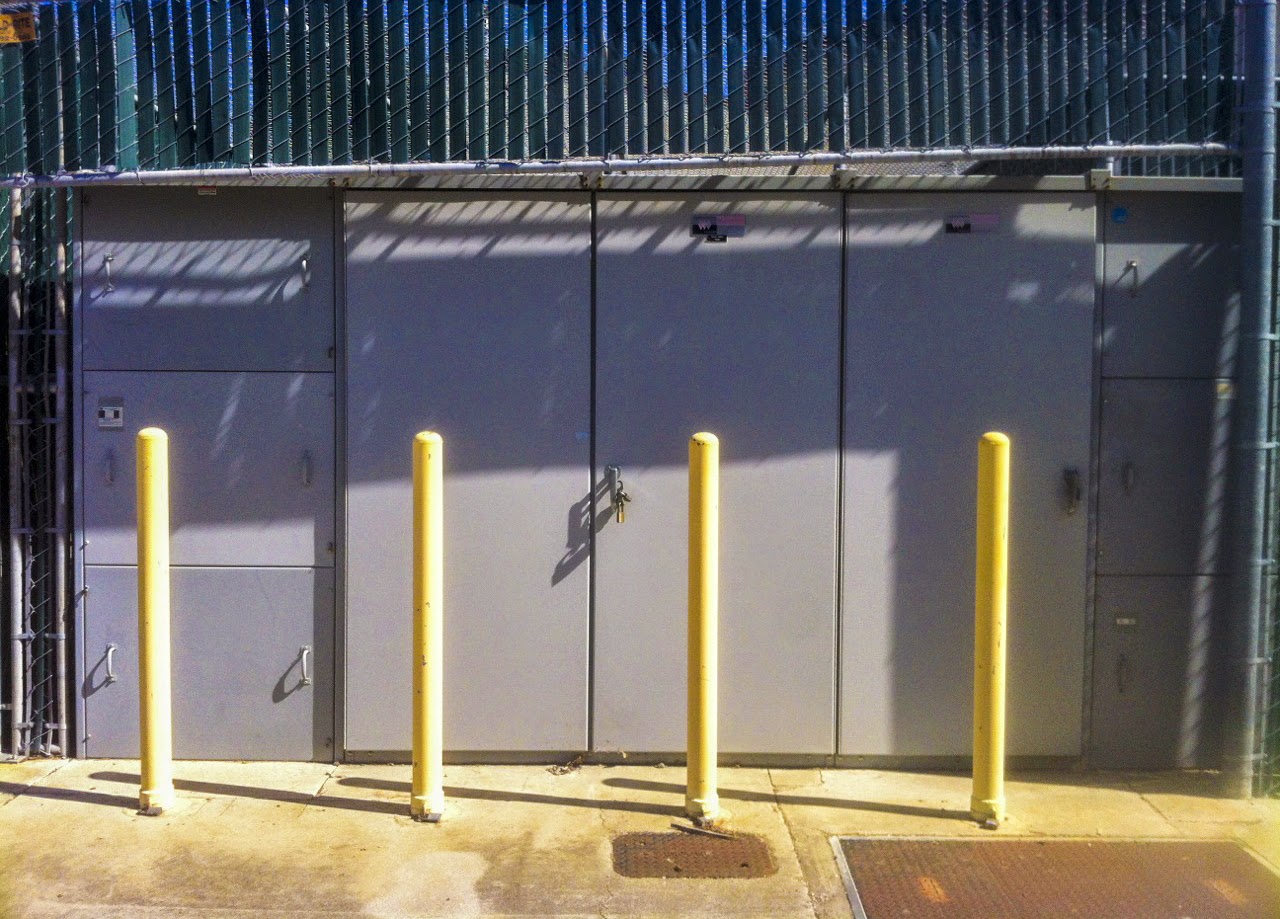
Their is repetition in the 4 yellow pole things, they separate the photo into sections. There is also repetition in the slats of the green planks on the top of the photo, and also repetition with the three doors behind the yellow poles. 

Edits:
Cropped
Contrast: +36
Highlights: +65
Shadows: -20
Whites: -25
Blacks: -27
Clarity: +33
Vibrance: +56
Saturation: +6

Principles of Design- Pattern


The pattern can be seen in the bricks, how each brick is off set with the row below it, but then in line with the next. There is also some pattern in the fact that the bricks make steps on the right side.

Edits:
cropped
Exposure: +.30
Contrast: +66
Highlights: +3
Whites: +23
Blacks: -23
Vibrance: +37

Thursday, March 12, 2015

Principles of Design- Movement


I tried to show movement by using the lines that the fence created. You start looking at the close part of the fence, but as you move down you notice lines, so you follow those. The lines fade but then the street picks up the lines at a new angle and you follow that. on the far right the sky is brighter than the rest of the picture so you look their and then continue looking through the trees along the top. Or you may have gotten to the right side and moved down towards the shadow and followed the rough line the yellow leaves made. 

Edits:
Cropped
Contrast: +12
Highlights: -28
Shadows: +48
Whites: +39
Vibrance: +34
Saturation: +13

Wednesday, March 11, 2015

Principles of Design- Emphasis


Emphasis is on the berries, structures are the back ground. The berries are a vivid color which draw your attention, they are also much closer and larger than would be expected. I would have preferred them to much clearer and to have better depth of field but unfortunately my phone does not have a very good camera. 

Edits:
Exposure: -.4
Contrast: +38
Highlights: +18
Whites: +11
Clarity: +56
Vibrance: +20
Saturation: +5

Principles of Design- Balance


This shows balance in the sense that it is symmetrical. The orange pipes are at opposite angles and connect with the horizontal fence at the same moment. The yellow pole is dead center with the two silver poles on either side, even though they were actually away from the center pole.  

Edits:
Cropped to straighten
Contrast: +35
Shadows: -45
Blacks: -31
Clarity: +24

Friday, March 6, 2015

Elements of Art - Plant Life Texture


Edits

Rotated and Cropped
exposure -1.35
contrast +27
highlights -17
shadows -14
clarity +31
saturation -100


Elements of Art - Plant Life Color


Edits:
Exposure -.90
Contrast +32
Whites -47
Clarity +34

Elements of Art - Plant Life Space


Edits for the 1st one:
exposure: +.95
blacks: +74
clarity: +28

Andrew was just to good not to include
Edits for 2nd one:
temperature +17
tint -4
highlights +38
shadows +54
clarity +38

Monday, March 2, 2015

Half Past Autumn - Gordon Parks pt 1 and pt 2

1) The doctor but him in an ice bath and scrubbed him against the ice.
2) Kansas
3) She told him that black people don't go to college, and the few that due don/t succeed.
4) 15
5) Saint Paul Minnesota to live with his sister.
6) He did not graduate High School but he received many honorary degrees from colleges.
7) He walked into the store Frank Murphy's and said he was a fashion photographer. They set up a shoot for him and he did pretty well.
8) Two pictures get exposed on the same frame of film.
9) He was a professional heavy weight champion boxer.
10) Piano
11) To educated the public of the poverty occurring during the great depression.
12) Go to a store and purchase an overcoat, walk across the street and eat at a restaurant, then cross to the corner and watch a movie.
13) She was a janitor is the farm administration building that Gordon photographed.
14) He was inspired by the architecture of a lone farm building and the culture of rural america.
15) He learned from Stryker that the people in front of the camera are the most important people, not the one taking the picture.

-----------------------------------------------------------

16) The FSA shut down of 1943.
17) He worked for Vouge
18) Wilson Hicks
19) After starting to work for LIFE his first major assignment was on crime, following Red Jackson.
20) Picasso, Vango, Brenard,Brugol
21) He shot fashion by letting his models move, and moving with them.
22) Venice
23) Elizabeth Campbell Rollins. She was a model.
24) He met Flavio when Flavio was 12.
25) Parks met Flavio in the early 1960's
26) Flavio lived in rio de janeiro in a favela.
27) Gloria Vanderbilt was an author actress and heiress. Her son is Anderson Cooper, and news anchor for CNN. Her ancestors are the Vanderbilt family who made a fortune in the railroad industry then expanded.
28) She said they were friends, but she also didn't care about the social boundaries, but Parks new that they mattered and would stop them from being anything more.

Friday, February 27, 2015

Elements of Art - Plant Life Shape


I changed clarity to 100. 
I've never done it that much and I wanted to because it looks cool, so I did.


Thursday, February 26, 2015

Elements of Art - Plant Life Lines


Changed in Camera Raw:
+27 contrast
+15 shadows
-24 blacks
+32 clarity
-100 saturation


Wednesday, February 25, 2015

Andrew and Rudrik's Assignment

From the slide show: Look From Behind, With Feeling

Number: 11

This photo is my favorite because:

It has more going on in it than the others. It looks much more intense with the destruction and the guy in a HAZ-MAT suit just walking away.

The painting that's leaning against wall is looking directly at the camera and the person in the painting looks suspicious, as if she caused the destruction.

It looks like it was a really nice house because of the crystal chandelier and fancy ceiling, so it's ironic that it's all destroyed.

Some rules of composition in it are:
texture, symmetry, rule of thirds.

Tuesday, February 24, 2015

Top 5 Photos Ranking

From the slideshow: An Embedded Photographer Empowers the Poor

1st: Number 9, click here
2nd: Number 15, click here
3rd: Number 8, click here
4th: Number 24, click here
5th: Number 22, click here


Friday, February 20, 2015

Redone Multimedia Poster


Why is this poster good?
We utilized many aspects of Photoshop to make a unique poster. It features a simple but elegant design with a pleasing background.

Why is it better than the last one?
This one showed superior digital photography skills through the use of layering and masking. It is still simple like the last one, but more pleasing to look at.

What did you do to create this one?
We started off with a blank canvas to the correct dimensions, and added a photo to it. Then we converted two other photos to smart objects, added them to the original background, and changed the opacity so they all blended and showed well. We used Mr. Farley's car picture, his sunset one, and a close up of a canvas bag Catherine Hou took. We then made several boxes with appealing colors, also with the opacity down. We then had to write the info and change the angle to make everything match up.


Thursday, February 12, 2015

Movie Monday-The Photo League Questions

  1. What was The Photo League's credo?
The camera was more than a means of recording reality; it was a device with the potential to change the world.
  1. What organization did The Photo League separate from?
The Film and Photo League
  1. What was the workshop?
The Photo League’s school, offering photography classes to anyone with a camera and $5 tuition. Director Sid Grossman insisted the goal of the photographer was to achieve an emotional connection with the subjects.
  1. Who taught "the workshop?"
Sid Grossman
  1. If you were to devote one year of your life to one project, what project is worth your time and energy?
    Photography related, Comparing modern and ancient japan. Not photography related, becoming the best ping pong player ever.
  2. What was The Harlem Document?
The Harlem Document is a portfolio of photographs that reveals Harlem’s poor living conditions and neighborhood in the 1930’s.
  1. Who started The Harlem Document?
Aaron Siskind started The Harlem Document.
  1. A photographer discusses a photograph where "the children looked like they came out of a __________ painting. Who was the painter?
Caravaggio
  1. Why did the photograph mentioned in #8 look like it was by the painter?
The kids all looked very sweet and innocent, but specifically the one sitting on the right had a perfect ray of light hitting his face, illuminating him.
  1. Who was Lewis Hine? (name two significant contributions)
He photographed child labor which showed children as young as eight working long   hours under dangerous conditions. Later in World War 1, Hine served as a photographer with Red Cross. He was also hired to record the construction of the Empire State Building.
  1. Who was Weegee?
Weegee was a photojournalist who took images of the aftermath of New York street crimes and disasters.
  1. How did The League change when The Nazis took power?
They became focused on supporting the war effort. They showed patriotism in America and gruesome descriptions of the war.
  1. How did The League change during WWII?
Photo League members enlisted with armed forces and took part in battles on every theatre of WWII.
  1. How did Siskind change after WWII?
Siskind turned away from the social and political world after WWII.
  1. What was the Saturday Evening post?
The Saturday Evening Post was a photojournalism magazine similar to LIFE.
  1. Who was Barbara Morgan? What did she photograph?
Barbara Morgan was an American photographer best known for her depictions of modern dancers.
  1. What eventually undermined the Photo League?
The Photo League was put on a list of possible totalitarian, communist, or fascist organizations, created by Tom Clark.
  1. What was the "Growing Menace" mentioned in the film?
Communism
  1. Who agreed to serve as President when The League was under investigation?
    W. Eugene Smith
What happened to the league?

FBI agent Angela Calomiris testified that Sid Grossman had recruited her from the Photo League into the Communist Party. Although the League was never officially on trial, people became scared and didn’t come anymore. Due to the loss of members, the Photo League closed down in the summer of 1951.